Responsive design and adaptive design are two approaches to creating websites and applications that provide an optimal viewing experience across different devices and screen sizes.
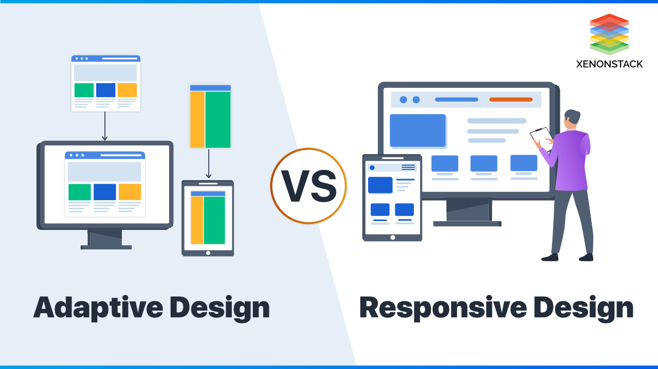
Responsive design involves using a fluid grid layout, flexible images, and media queries to automatically adjust the layout and content of a website based on the size of the screen it is being viewed on. This allows the site to reflow and adapt to different screen sizes, from desktop computers to smartphones.
On the other hand, adaptive design involves creating multiple versions of a website or application, each specifically tailored for different screen sizes. The server detects the screen size of the device accessing the site and serves the appropriate version. While this approach can provide more control over the user experience on different devices, it can also be more labor-intensive to maintain and update multiple versions of a site.
Both responsive and adaptive design have their own strengths and weaknesses, and the best approach will depend on the specific goals and requirements of a project. Ultimately, the goal of both approaches is to provide a seamless and user-friendly experience for all users, regardless of the device they are using.In recent years, the way people interact with websites has changed drastically. With the rise of mobile devices, it has become crucial for websites to be accessible and user-friendly on various screen sizes. This is where responsive and adaptive design comes in.Responsive design is an approach to web design that makes web pages render well on a variety of devices and window or screen sizes. It uses flexible grids and layouts, images, and CSS media queries to adjust the design to fit different screen sizes. This means that the website will automatically resize and reorganize content to provide the best viewing experience for the user, regardless of the device they are using.Adaptive design, on the other hand, is a method that uses multiple fixed layouts based on breakpoints to adjust the design to different screen sizes. This means that the design will change depending on the device, rather than fluidly adjusting like in responsive design.Both responsive and adaptive design have their own advantages and disadvantages. Responsive design is more flexible and future-proof, as it can adapt to any screen size now and in the future. However, it can sometimes be more complex to implement and might not always provide the best user experience on all devices. Adaptive design, on the other hand, can offer a more tailored experience for specific devices, but it requires more upfront planning and can be less flexible in the long run.Despite their differences, both responsive and adaptive design are important trends in web design today. With more and more people accessing websites on mobile devices, it is crucial for websites to provide a seamless experience across all devices. By utilizing responsive and adaptive design techniques, web designers can ensure that their websites are accessible, user-friendly, and visually appealing on any screen size.